Target Goes Flashy - Target #280, Taylor, Michigan
 |
| This post will look at retail in Taylor, Wayne County, MI. |
Target #280
14099 Pardee Road, Taylor, MI
Driving distance and time from downtown Detroit: 16.8 miles, approx. 20 minutes
In our last post about Target on SMR:MCRH, a contributor took us to a classic store that still sported an interior decor from 18 years ago. Today we're going to drive 20 minutes south (and 18 years into the future) to check on what Target has been up to today...
Just a typical Target cart corral, with a banner announcing the nationwide rollout of the Circle rewards program, which took place the day following my visit from which most of these photos were taken in. But, now it's time to reveal what has happened to this store...
"Now remodeled just for you!" And here we have it, a banner that has predicted what this post will discuss: Target's recent remodeling spree. Starting in 2017, Target announced an aggressive remodeling campaign that would include complete remodels of 1,000 stores by 2020, with nearly all of their stores having received these remodels by 2023. Today's post, which tours the Target store in Taylor, was part of Target's remodeling batch for late winter-early spring 2019, reopening on May 22, and features the most common (aka the most basic) version of the current remodel package, which is officially termed "P17" (which stands for "Prototype 2017").
The Target we'll tour today is located on Pardee Road in Taylor, just north of Southland Center (which we toured in yesterday's post). An interesting factoid: the P01 Target in Dearborn that we toured in our last Target post was located within close proximity to corporate headquarters and a major tourist attraction, this much busier Target has neither within that close of a proximity, but it is located right in the heart of the "Eureka Way" corridor along Eureka Road in southeast Taylor, which is arguably Downriver's hottest retail area as of right now.
This store was part of the original batch of six Detroit stores to open on October 7, 1987 to add Michigan to the list of states where then-Dayton-Hudson Corporation's Target subsidiary operated in. Target expanded this store in 1994 to increase backroom storage space. It's trade area includes almost all of Taylor, Southgate, Wyandotte, half of Romulus, two-thirds of Riverview, far northern Brownstown and Huron Townships and far southern Allen Park and Lincoln Park. When this Target opened in 1987, it's trade area was significantly bigger, extending from River Rouge and most of Allen Park south well into Monroe County, and likely even into Toledo, Ohio, which itself had no Target stores of it's own at the time. Alas, with additional store openings, this trade area has shrunken.
Now let's shift back to the topic of Target remodels. In early 2019, this store was remodeled to Target's P17 decor. Prior to that remodel, this store had the P09 decor (which was installed in a 2013 remodel to include an expanded grocery department). There are many photos of this store on Google Maps with this previous decor package, which you can see here (mixed in with a few post-remodel photos). Prior to 2013, this store had P01 (the decor we saw at the Dearborn store we toured in our last Target post). Before that, this store originally had this decor. So over a span of 32 years this store has had four different decor packages, which is a pretty good track record!
Stepping inside, immediately in front of us is Bullseye's Playground. Make a right at this spot and you'll enter a narrow hallway that leads to the restrooms and past a few other doors, after which you will come across "a fork in the road." One path leads you to a Fire Door, and the other leads you to this:
This is one of the two two-sectioned staircases leading up to the mezzanine offices, which are a common trait in late 80's-early 90's Target stores. This photo was taken on a previous visit.
Adjacent to that narrow hallway, we find a self-serve cafe (or "Snack Bar" as the official signage terms it). Prior to the P17 remodel, this was an old-school Target Cafe. This new incarnation offers fountain beverages, a beverage cooler and store-made popcorn. It's sad to see the old Target Cafes disappear, as the smell of popcorn has long become a Target tradition!
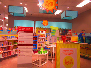
Immediately after the Guest Service counter, we enter the actual store. This small seasonal section was carved out of a small section of the clothing department. This photo and the next one below were, again, taken on a previous visit.
I would also like to point out that prior to the P17 remodel, the wall on the right wasn't there. The right actionway was around where that wall is today, and the fitting room entrance was on a diagonal wall quite similar to the Dearborn store's fitting room entrance.
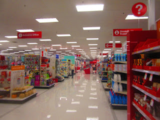
We jump over to the main horizontal center actionway, directly connecting the clothing departments with grocery.
Here's a look at the main vertical central actionway, connecting the front of the store with toys and electronics.
We are now looking back towards the clothing department from the main back actionway. Baby supplies are on the right, and on the left is electronics, which is signed as "Tech" (look carefully to the left of the support column). Speaking of the signs, P17's overhead department signage is a direct carryover from Target's previous decor package, P13. P13 was essentially P09's wall decor with these signs, not really marking much of any change from it's predecessors. Although several conventional Target stores received this decor remodel, including the Westland store, P13 was mainly used in City Target stores as well as in the now-defunct Target Canada division. P17 is one of the most radical decor changes Target has made in the past 15 years, switching from primarily red themes to primarily gray ones.
The back of the electronics... err... Tech department features one of the few remaining red wall accents left in the entire store. This store's CD and DVD selection was pretty significantly downplayed in the P17 remodel, being shrunken down to a single aisle and a quarter. Several other categories, including books and pop culture merchandise, remain largely unchanged in these remodels.
TVs are another Tech category that has remained largely unchanged. The main focus of this photo, though... it looks like someone forgot to remove one of the old P09 aisle markers during the remodel! Good thing I didn't inform the manager about this...
Moving away from Tech, we look down the back actionway towards the left side of the store. On the right, beyond Tech, is sporting goods.
An example of the P17 aisle markers, located in sporting goods.
The seasonal department is located at the back left corner of the store. Seasonal has always been located at this section, or at least it has been since the 2001 remodel. Notice how the wall bumps out to accomodate more sales space - that may have been part of the 2013 remodel.
We leave the back section of the store and take a look at the grocery department:
Turning the corner, this is what we see as we enter the grocery department.
Coolers line the left wall.
As in any PFresh store, near the front of the grocery department, we find the small selection of fresh foods. The wood-grained fixtures and decorations were added in the P17 remodel, as were the gray floor tiles.
Arriving back at the front of the store, we come across the CVS Pharmacy counter.
Here's a look down the main front actionway past the pharmacy area.
Beyond housewares and pets, we come across the Personal Care department, with a glimpse of the re-imaging Target did to this department in recent remodels. These include lower shelves and plenty of accent lighting, including these circular light fixtures for a modern touch.
Now that we've covered all we can cover in the main sales floor, let's proceed for the exit. Here's the front registers, which I believe consist of 8 regular lanes and 3 self-checkout lanes. Seen in the background are the in-store Starbucks and the windows for the mezzanine offices I mentioned earlier.
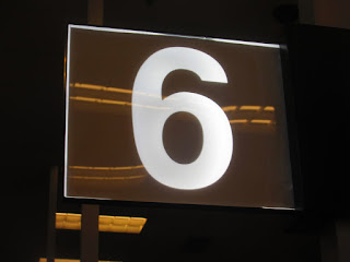
For P17, Target unveiled these lane lights. These lights are made out of glass panels with LEDs embedded within, which makes the numbers appear when turned on. In my opinion, these lights look neat and have a nice, modern feel to them.
Here's a closeup of the Starbucks.
And here's a closeup of one of the self-checkout registers.
And we leave with one last addition from the P17 remodel - spaces for Target's Drive Up order-to-vehicle service.
And there you have it - a Target that has gone flashy. So what's my opinion of this new era of Target? Well, it's nice and modern, but the gray walls and near-complete lack of wall accent pieces make it a little bland and generic. There have been recent Target remodels that are much fancier, but for now, this is as fancy as we can get here on SMR.
Now that we have completed our look at two different eras of Target, until next time....
October 17, 2019 Update: Even the sign at the back left corner of the exterior wall hasn't been left alone in the P17 remodel. As expected, the sign that had been there since 1987 was swapped out in favor of the "dreaded lowercase logo." I haven't photographed this change in person yet (as I never have any reason to go to this part of the exterior!), so a newly-uploaded Google Street View from less than a month after the P17 remodel's completion is substituted.


My local Target, which opened in 2018, has a new self-checkout system. To pay with cash, you have to get an employee's assistance. This is likely because most of their payments are Gift-Card or Red-Card anyway, but i still find it interesting because it appears to be designed specifically for Target.
ReplyDelete